Desktop
Desktop Section – Alpaca System
The Desktop section is the centralized dashboard of your clinical management system. It provides an at-a-glance overview of essential performance indicators across financials, patient flow, communications, and user activity. With two main tabs—Statistics and Charts—this area supports data-driven decision-making, daily operations management, and real-time performance tracking.
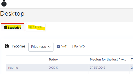
Statistics Tab
This tab presents structured data tables with both real-time and historical performance indicators. The layout allows users to compare daily progress, evaluate monthly metrics, and analyze trends across key areas of clinic operations.
Each table shares a consistent structure with the following columns:
Today – Data for the current date
Median for the Last 4 Weeks (Same Day) – Average performance for this weekday over the last month
This Month – Accumulated metrics for the current month
Last Month (Same Date) – Comparative data from the previous month up to the current day
Last Month (Total) – Full data for the entire last month
Forecast (Opened Hours) – Projections based on available working hours
Common Features:
Per WD Columns – Option to include per working day averages for current and previous months
Refresh Button – Update data in real time
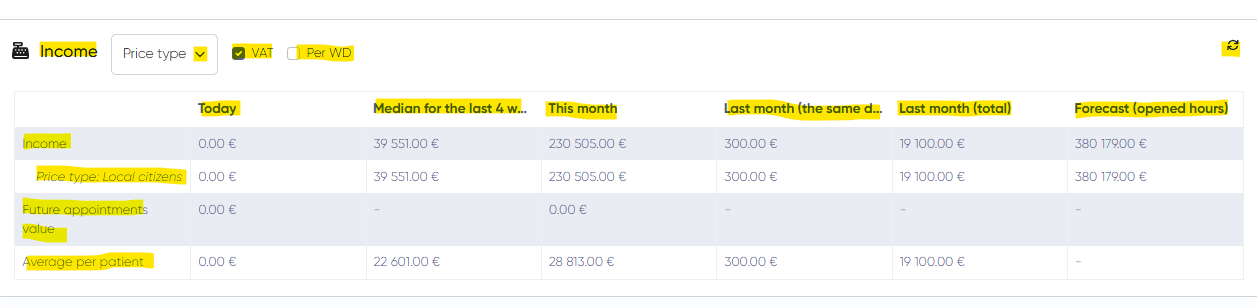
1. Income Table
Offers insights into the clinic’s financial performance. Helps track revenue trends and assess income potential.
Data Rows:
Total Income
Breakdown by Price Types or CFRs (switchable)
Future Appointment Value (potential income)
Average Income Per Patient
Filters and Options:
Price Type / CFR switch
VAT incl. / excl. toggle
Per WD Columns
Refresh
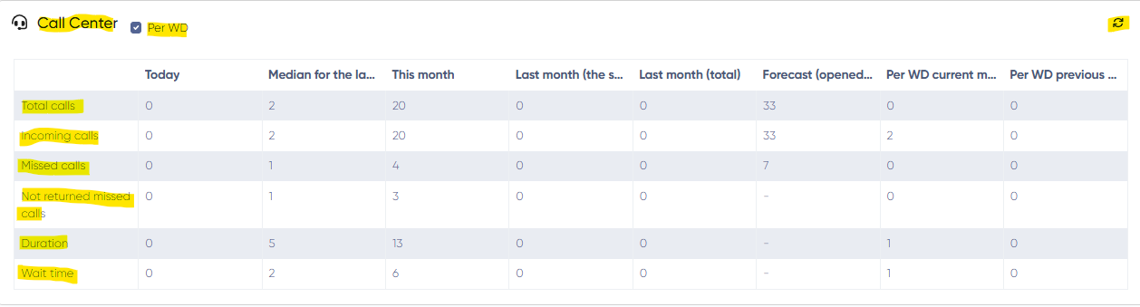
2. Call Center Table
Monitors phone activity, enabling front-desk efficiency assessment and customer service tracking.
Data Rows:
Total Calls
Incoming Calls
Missed Calls
Not Returned Missed Calls
Call Duration
Average Wait Time
Controls:
Per WD Columns
Refresh
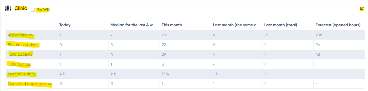
3. Clinic Table
Tracks overall operational efficiency and patient engagement. Useful for evaluating appointment rates and resource utilization.
Data Rows:
Total Appointments
First-Time Patients
Total Patients
Total Active Doctors
Doctor Load (%) – appointment hours vs availability
Cancelled Appointments
Controls:
Per WD Columns
Refresh
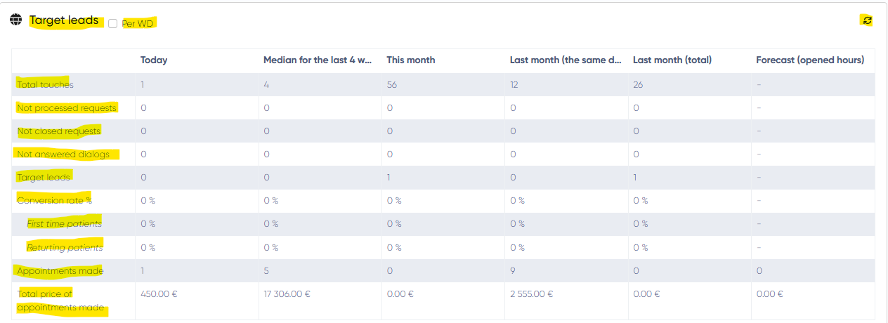
4. Target Leads Table
Provides a detailed view of the clinic's marketing effectiveness and CRM follow-ups.
Data Rows:
Total Touches (initial contacts)
Not Processed Requests
Not Closed Requests
Unanswered Dialogs
Target Leads
Conversion Rate – Overall, First-Time Patients, Returning Patients
Appointments Made
Total Price of Appointments Made
Controls:
Per WD Columns
Refresh
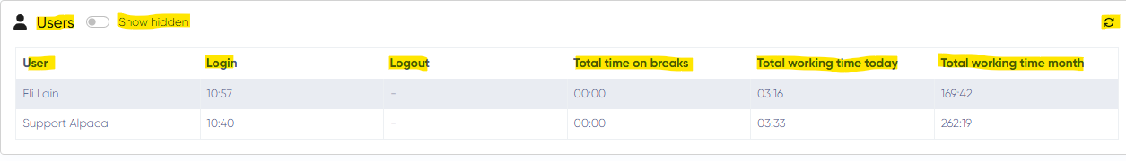
5. Users Table
Tracks staff login/logout times, breaks, and work hours—ideal for HR or management monitoring.
Data Columns:
User Name
Login Time
Logout Time
Total Time on Breaks
Total Working Time (Today)
Total Working Time (Monthly)
Controls:
Show Hidden Users
Refresh
Charts Tab
This section provides visualized data trends for income, appointment statistics, lead conversions, and patient sources. Useful for high-level analysis and presentations.
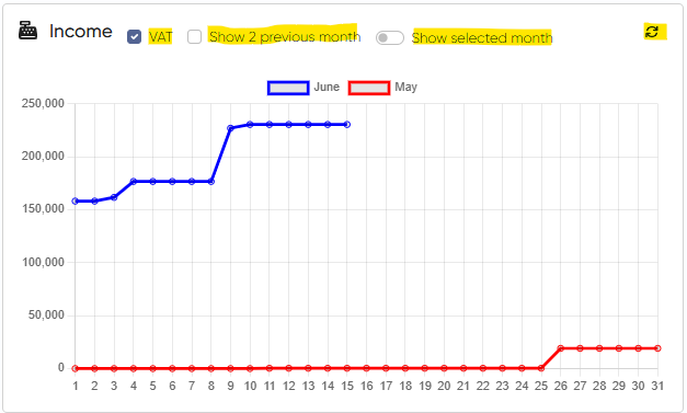
1. Income Chart (Monthly)
Visualizes the clinic’s income throughout the current month with optional comparison to previous periods.
Axes:
X: Day of Month
Y: Revenue (with VAT incl./excl. option)
Buttons:
VAT incl./excl.
Show Last 2 Months
Show Selected Month
Refresh
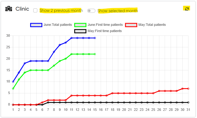
2. Clinic Chart (Monthly)
Displays patient visit trends, including first-time and total appointments over time.
Graphs:
First-Time Appointments (This & Previous Month)
Total Appointments (This & Previous Month)
Customization:
Toggle visibility for each graph
Choose Month
Show the last 2 months
Refresh
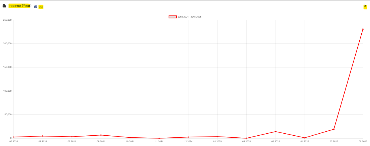
3. Income Chart (Yearly)
Year-long view of income growth or fluctuations, with each point representing monthly totals.
Axes:
X: Month
Y: Income
Controls:
VAT incl./excl.
Refresh
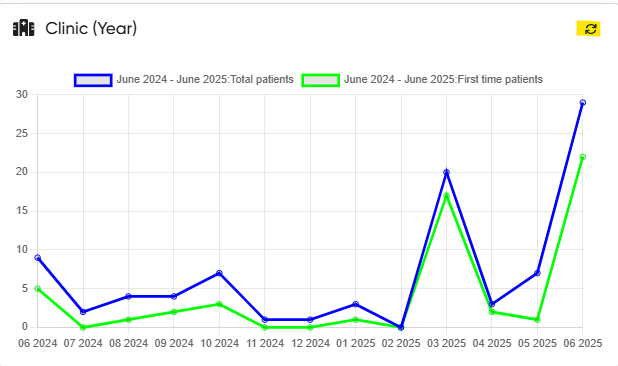
4. Clinic Chart (Yearly)
Visualizes monthly appointment trends for total and first-time patients.
Graphs:
Total Appointments
First-Time Appointments
Controls:
Toggle graph visibility
Refresh
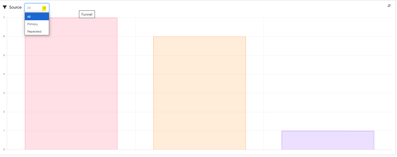
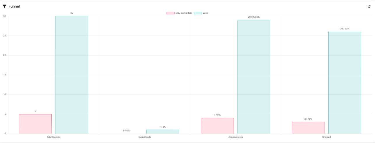
5. Funnel Diagram
Graphical breakdown of the patient journey through the marketing funnel.
Stages:
Total Touches
Target Leads (% and count)
Appointments (% and count)
Showed (% and count)
Comparison:
This month vs the same period last month
Refresh available
6. Patient Source Bar Graph
Analyzes patient origin based on referral sources, enabling marketing ROI assessment.
Filter:
All
Primary
Repeated
Control:
Refresh